Interpretations of ROC-AUC & PR-AUC metrics
What ROC-AUC and PR-AUC (average precision) actually measure, why they diverge under class imbalance, how prevalence moves PR but not ROC, and how to pick a metric from the decision you need to make.
Reading ROC-AUC and PR-AUC Correctly
A trained classifier gives every example a score, and that single ranked list can be interrogated in several different ways. Three questions matter, and they are genuinely separate:
- How well does the score rank positives above negatives? (ROC-AUC)
- What precision-recall tradeoff does that ranking allow, given how rare positives are? (the PR curve / average precision)
- Which operating threshold produces acceptable business or safety outcomes? (a decision no AUC answers on its own)
These metrics often get thrown around but not well understood. Let’s break them down cleanly, with intuition, a worked example, and guidance on when to use each. One framing to hold onto throughout: ROC-AUC and PR summaries score a ranking; they neither pick a threshold nor tell us whether the predicted probabilities are trustworthy.
Part 1: ROC-AUC: What it really measures
ROC curve = Receiver Operating Characteristic curve.
- It plots True Positive Rate (Recall) vs. False Positive Rate (FPR = FP / (FP+TN)) at all classification thresholds.
- The AUC (Area Under Curve) is the probability that a randomly chosen positive example is ranked above a randomly chosen negative example.
Interpretation of ROC-AUC = 0.90
- If we pick one positive sample and one negative sample, our model will score the positive higher 90% of the time.
- Equivalently: the model is very good at separating the classes overall.
Extreme cases:
- 0.5 → random ranking in expectation (the diagonal line).
- 1.0 → perfect separation.
- Below 0.5 → worse than random, which usually means the ranking is systematically reversed (a sign flip somewhere worth hunting down). Ties between a positive and a negative score count as half credit in the standard convention.
What ROC-AUC is not. This is a measure of discrimination - ranking quality - and nothing more. A 0.90 ROC-AUC does not mean 90% accuracy, does not mean the model’s probabilities are well-calibrated, does not promise useful precision, and says nothing about performance at whatever threshold we actually deploy. It is one number about the order of the list, not about where we cut it.
Part 2: PR-AUC and Average Precision: What they measure
The Precision-Recall curve plots Precision against Recall as we sweep the threshold. It answers: when we push for higher recall, how much precision do we surrender?
A naming subtlety trips people up here: there is more than one way to collapse this curve into a single number, and they are not interchangeable.
- AUPRC via trapezoidal integration: the literal area under the plotted PR curve.
- Average Precision (AP): a recall-increment-weighted sum of precision, $\text{AP} = \sum_k (R_k - R_{k-1})\,P_k$. This is what scikit-learn’s
average_precision_scorecomputes, and it is deliberately not the trapezoidal area (linear interpolation on a PR curve can be optimistically wrong). The two can disagree on the very same ranking.
For the rest of this post, “PR-AUC” means average precision (AP), the more standard and less misleading of the two. When reporting a score, always name which one it is.
What does an AP of, say, 0.60 actually mean?
Less than the tidy phrase “60% average precision” suggests. It does not mean that 60% of the model’s predicted positives are correct “on average,” and it does not promise any threshold where precision reaches 60%. It is a single summary of the whole ranking under the AP convention, computed on a dataset with a particular prevalence. The only honest way to read it is relative to the random baseline (derived below) and by looking at the actual curve - specifically, the precision available at the recall the product needs.
A Worked Example: One Model, Two Lenses, One Decision
Numbers make this concrete. Take a fraud-detection model scoring 1,000 transactions of which 15 are fraud (prevalence 1.5%). Scikit-learn reports ROC-AUC = 0.92 and AP = 0.32. The ROC number looks superb; the AP looks middling. Both are correct, and the gap between them is the lesson: strong ranking, but a hard precision-recall reality once positives are rare.
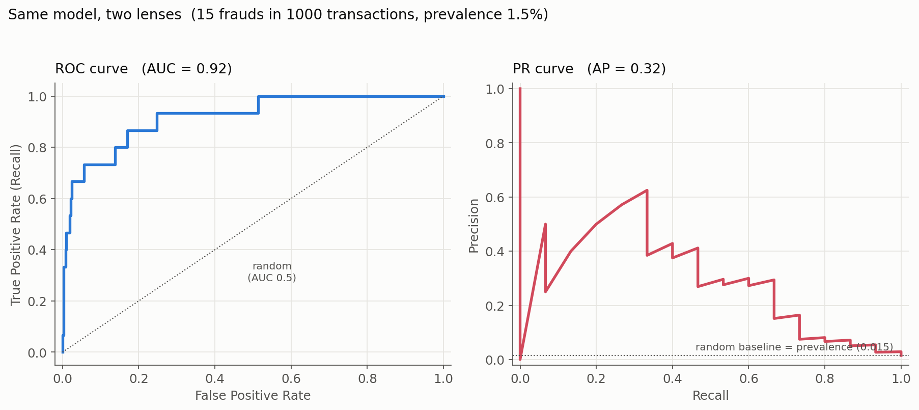
Now the third question the AUCs cannot answer: where do we set the threshold? Two candidates, each a real point on that PR curve:
| Threshold | Recall | Precision | Frauds caught (of 15) | Reviews (TP+FP) | Expected cost |
|---|---|---|---|---|---|
| High-recall | 0.87 | 0.05 | 13 | 257 | \$2,285 |
| Capacity-limited | 0.53 | 0.28 | 8 | 29 | \$3,645 |
(Cost assumes \$500 per missed fraud and \$5 per transaction reviewed; doing nothing costs \$7,500.) Notice what the celebrated 0.92 ROC-AUC hides: at the high-recall setting, precision is just 5% - we catch 13 of 15 frauds, but only by wading through 244 false alarms. Which threshold wins depends entirely on the cost of a missed fraud versus the cost of a review, and on how many reviews the team can realistically run. That is the decision, and it lives on the curve, not in the summary score.
Part 3: Choosing a Metric (It’s About the Decision, Not Just Balance)
The usual rule of thumb - “balanced data → ROC-AUC, imbalanced → PR-AUC” - is a reasonable first instinct but too blunt. The sharper question is what decision are we making, and under what constraints?
| Decision need | Useful evaluation |
|---|---|
| Overall pairwise ranking across classes | ROC-AUC |
| Retrieval quality for a rare positive class | PR curve + AP (report prevalence) |
| Fixed review capacity (top-$k$) | Precision / recall / lift at top-$k$ |
| Hard false-positive budget | Recall at a fixed FPR (or partial ROC-AUC) |
| Hard recall requirement | Precision at the required recall |
| Are the probabilities trustworthy? | Log loss, Brier score, calibration plot |
| Ship / don’t ship | Expected cost or utility at candidate thresholds |
The single property that most separates ROC from PR is sensitivity to prevalence. PR metrics depend strongly on how rare positives are; ROC-AUC barely does. The figure below drives this home: the same model (identical class-conditional score distributions) is evaluated at 20% and 2% prevalence. The ROC curves lie almost on top of each other (AUC 0.91 both times), while the PR curves - and the average precision - move dramatically (AP 0.76 vs 0.29):
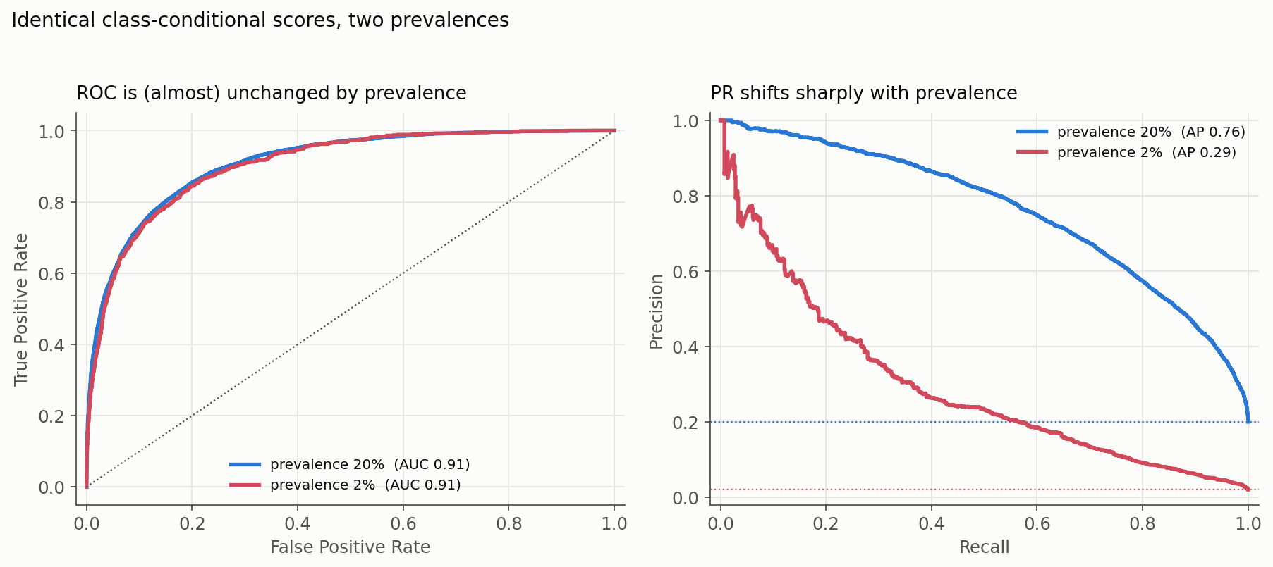
The practical consequence is a common and expensive mistake: a PR-AUC measured on an artificially balanced test set will badly overstate the precision we will actually get in production, where positives might be 1%. Always evaluate PR at the prevalence we expect to deploy under, and report that prevalence beside the score. This is exactly why our fraud model’s 0.92 ROC-AUC could coexist with a 5%-precision operating point: ROC did not feel the 1.5% prevalence, but the operating decision certainly did. (For the theory and interpolation caveats behind all this, Davis and Goadrich’s paper is the classic reference.)
Part 4: Comparison to Accuracy / Precision / Recall
- Accuracy: fraction of correct predictions.
- Misleading on imbalanced data (99% accuracy just by always predicting “negative”).
- Precision: of the predicted positives, how many were correct.
- Recall: of all true positives, how many we caught.
- These depend on one threshold (say 0.5 cutoff).
ROC-AUC and PR-AUC don’t depend on a fixed threshold.
- They summarize performance across all possible thresholds at once.
- That makes them threshold-agnostic, which is handy for comparing models before a cutoff is chosen. It does not make them automatically “robust” or operationally relevant: they average over thresholds the product would never ship, including absurd ones. If the business tolerates only an FPR below 0.1%, the model’s behaviour way out at FPR = 0.6 is irrelevant to us, yet it still feeds the AUC. When constraints are hard, report the targeted quantity directly - recall at the permitted FPR, precision at the required recall, or a partial AUC over the usable region - rather than the whole-curve summary.
Part 5: Rule of Thumb
The decision table above is the real guide, but if a one-liner helps:
- ROC-AUC for overall ranking quality when comparing models’ ability to separate the classes.
- AP / PR curve (with prevalence stated) when positives are rare and we care about the usefulness of predicted positives.
- Precision / Recall / cost at a chosen threshold when a cutoff is fixed by a business or regulatory rule - and choose that threshold on validation data, never on the final test set.
So 90% ROC-AUC means our model ranks a positive above a negative about 9 times out of 10 - strong discrimination. Whether that translates into useful predictions depends on prevalence, the operating threshold, and the costs involved, which is exactly why PR-based metrics and an explicit threshold decision matter so much in imbalanced settings.
Ranking Is Not Calibration
One last axis these curves are blind to. Consider two models that produce these scores on the same four examples (the first two are the true positives, the last two the true negatives):
- Model A:
0.9, 0.8, 0.2, 0.1 - Model B:
0.6, 0.55, 0.45, 0.4
They rank the four examples in the identical order, so they have the same ROC-AUC and the same AP. But they express very different confidence: Model A is emphatic, Model B is timid. The moment we use the probabilities themselves - to set an expected-value threshold, to average several models, or to show a “risk score” to a human - that difference is everything, and ranking metrics cannot see it. That is what calibration metrics (log loss, Brier score, a reliability plot) are for. Ranking quality, threshold choice, and calibration are three different questions, and a complete evaluation usually needs all three.
Deep Dive: Why the PR Baseline Is the Prevalence
Let’s drill into an average precision of 0.60, what it does and doesn’t say, and why the random baseline is the positive prevalence (about 0.01 if only 1% of examples are positive).
What an AP of 0.60 does and doesn’t say
Suppose average precision comes out to 0.60. The tempting reading, “60% of predicted positives are correct on average,” is not right, for a subtle reason: AP is a recall-weighted average of precision over the whole curve, not a number we can pin to any single operating point. There may be no threshold at all where precision equals 60%.
What 0.60 does tell us is comparative. It sits far above the random baseline for a rare-positive problem (which, as we show next, equals the prevalence). If positives are 1% of the data, a random ranking scores about 0.01, so 0.60 reflects a ranking that concentrates true positives near the top far better than chance. To turn that into an actual decision, we still have to read the precision off the curve at the recall we need.
Why the random baseline equals the prevalence
Suppose we have a dataset of 10,000 samples:
- 100 are positive (1%).
- 9,900 are negative.
Now imagine a random classifier that assigns random scores. If we sweep thresholds:
- At any threshold, the set of predicted positives is a random subset of the population.
- So the expected fraction of true positives inside that set = prevalence = 100 / 10,000 = 0.01.
So, in expectation:
- precision is flat at 0.01, regardless of recall (any one finite sample wobbles around this);
- the PR curve is a horizontal line at 0.01;
- the area under it (and the AP) is 0.01.
That’s why:
- the PR baseline is the positive rate (whereas the ROC baseline is always 0.5, independent of prevalence);
- an AP of 0.60 means the model is far better than random when prevalence is low (say 1%) - though, as stressed above, “far better than random” is about the ranking, not a guaranteed precision at any threshold.
Why does this matter?
Return to a 1%-positive dataset:
- ROC-AUC = 0.90 can sound “great,” yet the top of the ranking may still be mostly false alarms once positives are this rare (exactly what we saw in the worked example).
- AP = 0.60 says the ranking concentrates true positives near the top far better than the 0.01 random baseline. It is tempting to call this “60x better than random” ($0.60 / 0.01 = 60$), and as a rough ratio of summary scores that is fine - but it is not a promise that any selected set, or any threshold we pick, achieves 60% precision or a literal 60-fold enrichment. The summary ratio and the per-threshold reality are different things.
Summary
- AP = 0.60 is a single summary of the ranking under the average-precision convention, read relative to prevalence - not a literal “60% of predicted positives are correct.”
- A random ranking’s AP ≈ the positive prevalence, because its predicted-positive sets are random subsets whose expected precision is the base rate (≈ 0.01 at 1% positives).
- That is why AP is the go-to metric for imbalanced problems: it measures how much better than the base rate the ranking concentrates positives - while the operating decision still comes from the curve and the costs, not from the summary number.
Resources
- Davis, J. & Goadrich, M. (2006). The Relationship Between Precision-Recall and ROC Curves. ICML.
- scikit-learn:
average_precision_score- note the docs explicitly warn it is not the trapezoidal area under the PR curve.